Dendrogram
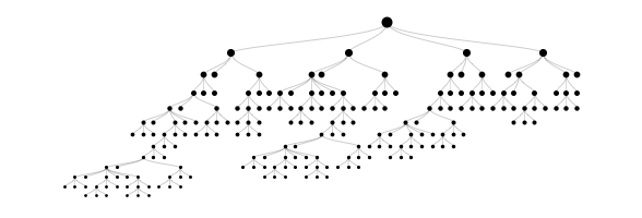
/In case you didn't know, I love data visualization. The dendrogram is one of my favs - it's a tree diagram frequently used to illustrate the arrangement of the hierarchies. Dendrograms are often used in computational biology to illustrate the clustering of genes or samples (figure on right). But as with any tree diagram, they can quickly become unwieldy. I study graphs often enough that I've developed some nifty little utilities for viewing them. One of my favorite from an aesthetic point of view is above on the left. With just a tiny bit of math, dendrograms can be transformed into an arguably more palatable polar form.
Tree Plot
polar dendrogram
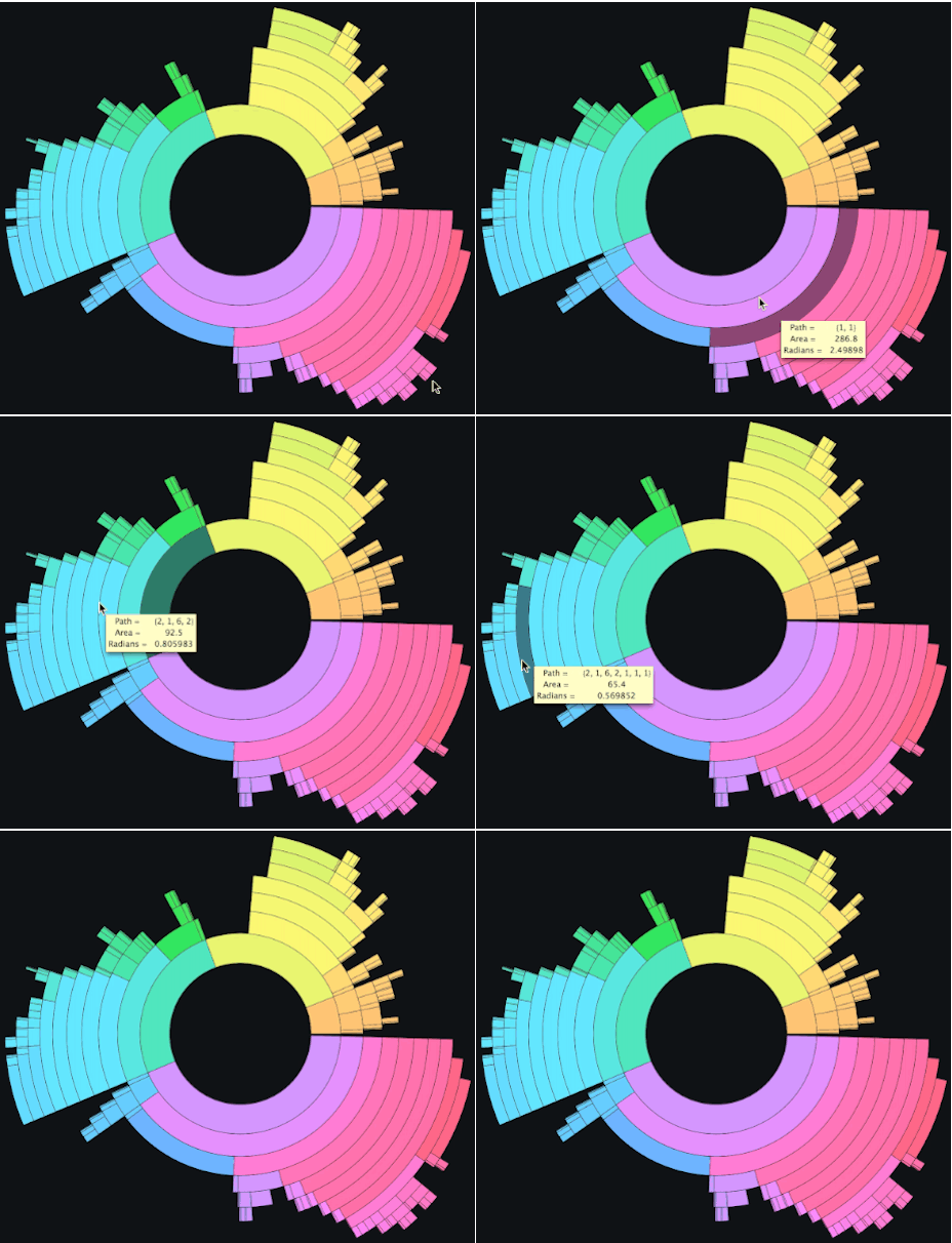
But what if the tree is very large and you want to be able to inspect the clustering structure of weighted leaves? For this, polar tree maps are handy. Here's an example - the two diagrams on the right are different views of the exact same underlying tree structure.
If you have a Mac, check out the app DaisyDisk - an extremely useful disk usage analysis tool and tour-de-force showcase for polar tree maps. Indeed, with different color schemes they can become interactive pieces of modern art!


